Sophistication in design often comes not from addition but from subtraction. The most enduring interiors are frequently those that have resisted the temptation to fill every surface, engage every color, and answer every visual question. They leave space for thought, for feeling, for the particular quality of presence that arrives when things are given room to breathe.
This is the same instinct that drives the most compelling monochrome abstract art on textured canvas: the choice to work within constraint, to find depth within limitation, and to discover that the space between black and white contains more visual richness than many artists ever locate within the full chromatic spectrum.
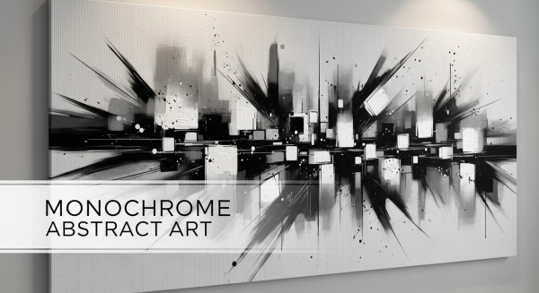
Black white painting with genuine dimensional surface has become one of the defining aesthetic statements of contemporary interior design. From minimalist apartments to luxury hospitality spaces, from forward-thinking corporate environments to private art collections, monochrome textured canvas art is increasingly recognized not as a modest or conservative choice but as one of the most sophisticated available.
This article explores why that recognition is warranted; what makes monochrome abstract art so enduringly compelling, how texture transforms the experience of black and white composition, and how these works function in the contemporary spaces designed to receive them.
What Monochrome Abstract Art Actually Represents
A Deliberate Choice With Deep Roots
The decision to make art in black and white is far older than modern minimalism. Ink painting traditions in China and Japan developed over more than a thousand years the extraordinary expressive range available within a single pigment on white paper. Etching and engraving built entire artistic cultures around tonal variation without color. Photography spent its first century in monochrome and produced some of the most powerful images in the history of visual art.
What contemporary monochrome abstract art inherits from these traditions is the understanding that the removal of color does not diminish a work; it concentrates it. Every decision about tonal value, edge quality, compositional balance, and surface character carries more weight when it is not sharing that weight with color relationships. The work must succeed entirely through qualities that color often masks or supplements.
This concentration of artistic responsibility is precisely what makes successful monochrome abstract art so compelling. When it works; when the composition holds, when the tonal relationships are rich and varied, when the surface has genuine physical life; you are seeing something achieved through genuine artistic intelligence and skill.
The Evolution of Monochrome in Contemporary Design
The current prominence of monochrome art in contemporary interior design reflects broader aesthetic movements that have been building for decades. The influence of Scandinavian design, with its emphasis on functional beauty, natural materials, and restrained palettes, has been substantial in shaping global design taste. The minimalist movement, with its rejection of accumulation and its commitment to considered editing, has made the deliberate choice of less over more into a positive design value rather than a compromise.
In this cultural context, black white painting with genuine artistic depth is not a neutral choice. It is a statement: of aesthetic confidence, of preference for depth over immediacy, and of the kind of sustained engagement with visual culture that chooses quality over stimulation.
The Psychology of Black, White, and the Space Between
What Monochrome Does to a Room
Colors carry psychological weight, and the research on this is clear enough to be practically useful for interior design. Black conveys authority, sophistication, and weight. White conveys openness, clarity, and possibility. The greys between them carry associations that shift depending on temperature; warm greys feel intimate and organic, cool greys feel precise and architectural.
A monochrome abstract artwork brings these qualities into a room in a way that is more sophisticated and flexible than a simply black-and-white decorative scheme. Because the tonal range of a well-executed black white painting includes warm blacks, cool blacks, luminous near-whites, and a full range of grey mid-tones, the work can simultaneously evoke multiple qualities; authority and openness, intimacy and precision.
The psychological effect of this is an impression of depth and complexity that feels genuinely earned rather than simply achieved through chromatic variety.
Monochrome and Spatial Perception
Interior designers and architects have long understood that lighter spaces feel larger and darker spaces feel more intimate. Monochrome abstract art plays with this perception in interesting ways. A painting with areas of deep, rich black creates visual anchors; places where the eye comes to rest, where gravity is felt. Areas of luminous near-white or pale grey create expansion; spaces within the composition that feel open and airy.
A well-composed monochrome artwork thus creates its own internal spatial dynamic; a miniature landscape of expansion and compression, openness and depth; that enriches the spatial experience of the room it inhabits.
Techniques That Create Depth in Black and White Work
Layering as the Foundation
The textured canvas works that define the contemporary monochrome abstract art market achieve their visual richness through extensive layering. Unlike works in which a final surface is applied in one or two passes, layered textured paintings are built through many sequential applications of material, each one modifying and responding to what was already there.
This layering creates what might be called temporal depth; a sense that the surface has a history, that what you are seeing is the result of an accumulative process rather than a single gesture. Viewers respond to this quality intuitively; it is what creates the sense that a work rewards close examination, that there is always more to discover.
In practical terms, layering in monochrome textured canvas work involves alternating between building phases; applying modeling paste, plaster compounds, or thick acrylic medium to build physical relief; and painterly phases, applying washes, glazes, and direct paint applications that create tonal variation across the dimensional surface.
The Palette Knife and Its Distinctive Marks
The palette knife is perhaps the most characteristic tool of contemporary textured abstract painting. Unlike brushes, which create marks with consistent edges and predictable texture, palette knives apply and drag paint in ways that create long, smooth planes with sharp edges; the mark of a blade dragging across a surface.
In monochrome work, palette knife technique creates the visual vocabulary of geological stratification; layers of material that seem compressed and revealed, like cross-sections of stone. The sharp edges of knife marks catch light differently than the soft gradients of brushwork, creating a visual complexity of edge quality that adds to the tonal complexity of the work.
Some artists use palette knives almost exclusively; building entire surfaces through accumulation of knife marks in varying sizes and directions. Others combine knife work with brush passages and other techniques, creating surfaces of greater variety.
Dry Brushing and Glazing
Two complementary techniques that are particularly important in monochrome textured canvas work are dry brushing and glazing; they work in opposite directions and together create the full tonal range that makes these works so visually rich.
Dry brushing involves loading a brush with paint and then removing most of the paint on a cloth or paper before applying the brush to the textured surface. The result is paint that deposits only on the raised peaks of the texture, leaving the recesses unaffected. In a light grey dry brush over a darker textured ground, this creates an effect of luminosity; the raised areas catch the light and appear brighter, giving the surface a three-dimensional quality even without directional lighting.
Glazing works in the opposite direction; thin, transparent layers of dark color settle into the recesses of a textured surface, deepening the shadows and creating the sense of depth beneath the main surface. The combination of dry brushed highlights and glazed shadows creates the full appearance of three-dimensional form on a textured surface.
Blending and Gradation
Within monochrome abstract art, tonal gradation; the smooth transition between light and dark areas; carries much of the emotional weight that color carries in chromatic painting. A gradation from deep, rich black through a range of warm and cool greys to luminous near-white creates a composition with genuine atmospheric depth; the feeling of light entering a space or of form emerging from shadow.
Creating smooth gradations on a textured surface requires skill and patience; the texture interrupts smooth blending in ways that must be worked with rather than against. Artists who handle this well create surfaces where the gradation flows naturally through the textural variation, with the texture itself contributing to the quality of the tonal transition rather than fighting it.
The Aesthetic Value of Texture in Monochrome Art
Why Texture Matters More Without Color
In a chromatic painting, texture is one element among several; color relationships, compositional balance, and representational content all share the role of creating visual interest. When color is removed, texture becomes a primary vehicle of visual complexity and interest. This increased importance demands and enables greater development.
Artists working seriously in monochrome textured canvas art typically develop the surface of their work more extensively than they would in a colorful piece. The texture must carry more; it must be rich enough in variation, dynamic enough in its response to light, and compositionally integrated enough that it holds attention and sustains engagement.
The result of this increased attention is surfaces of considerable complexity; works that reward examination at different distances and under different light conditions, revealing new aspects of their structure and tonal character as the viewing conditions change.
The Relationship Between Texture and Tonal Value
One of the most interesting qualities of textured monochrome painting is the way that physical surface geometry creates apparent tonal variation without any difference in paint application. The same grey paint, applied uniformly to a textured surface, appears lighter where the surface faces the light and darker where it faces away. This geometry-created tonal variation adds an entire dimension of apparent tonal complexity to the work; one that changes dynamically as the light source angle changes.
This means that a monochrome textured canvas painting has, in effect, an infinite range of apparent tonal values; not limited by the tonal range of the paints applied, but extended by the continuously varying interaction of surface geometry and light.
Monochrome Abstract Art in Contemporary Interiors
Why Minimalist Spaces Need Monochrome Textured Art
Contemporary minimalist interiors; those committed to limited palettes, uncluttered surfaces, and careful selection of every element; face a particular design challenge: how to maintain visual interest and warmth without adding visual noise. A room with white walls, light wood floors, and simple furniture is calm and spacious; but without something to engage the eye and provide a focal point, it can feel empty rather than considered.
Monochrome textured canvas art solves this problem elegantly. A single significant piece on a primary wall provides genuine visual interest without introducing color complexity that would compete with the minimalist palette. The physical texture of the surface creates warmth and craft quality; the opposite of the coldness that minimal spaces sometimes risk. And the compositional depth of good abstract work gives the eye a genuinely engaging destination.
Living Rooms: Anchoring the Main Space
The primary living space is where monochrome abstract art has its most significant opportunity. A large black white painting with textured canvas surface on the main visible wall of a living room creates an immediate impression of sophistication and genuine artistic engagement.
For this position, scale matters enormously. The work should be large enough to anchor the visual composition of the room; typically occupying 60 to 75 percent of the wall width. At this scale, the physical texture of the surface will be clearly visible even from across the room, creating a quality of presence and depth that flat art at the same size cannot achieve.
Furniture placement should acknowledge the artwork; a primary seating arrangement facing or angled toward the artwork creates a visual and social composition that treats the piece as a genuine presence rather than background decoration.
Office and Professional Environments
Black white painting with genuine textural complexity is particularly effective in professional settings. Monochrome abstract art communicates sophistication and cultural engagement without the potential divisiveness of figurative or overtly colorful work; it is almost universally received positively by diverse audiences.
In a reception area, a significant monochrome textured canvas creates an immediate impression of investment in quality and attention to the designed environment. In a conference or boardroom, it creates an atmosphere of considered sophistication appropriate to serious professional interaction. In a home office, particularly for those who appear regularly on video calls, it creates a background that reads as genuinely designed rather than improvised.
A detailed perspective on how different types of modern and abstract art perform in both home and professional office contexts can be found in this practical review of modern abstract art choices for various interior settings, which provides real-world guidance on selecting and placing contemporary art in different types of spaces.
Gallery Walls: Monochrome as Organizing Principle
A gallery wall composed entirely of monochrome pieces; varying in size, texture, and compositional approach; can be one of the most sophisticated approaches to multi-piece wall display in a contemporary interior. The monochrome palette provides visual coherence that allows the varying scale, framing, and surface character of individual pieces to feel like deliberate variety rather than inconsistency.
When composing a monochrome gallery wall, the most important considerations are spacing; generous and consistent between pieces to allow each to read individually; and compositional balance across the whole arrangement. Mixing different surface treatments within a monochrome palette; smooth prints, textured paintings, drawings with visible mark-making; creates the variety that maintains interest within the organizing unity of the shared color scheme.
Styling Monochrome Art With Furniture and Decor
Creating Productive Contrast
The most effective styling approach for monochrome abstract art in a contemporary interior involves creating deliberate contrast; between the restraint of the artwork and the richness of surrounding materials. A monochrome textured canvas above a sofa in deep, saturated color; forest green velvet, midnight blue linen, warm terracotta; creates a dialogue between disciplines that enriches both.
The restraint of the artwork makes the richness of the upholstery more apparent. The warmth of the upholstery makes the sophistication of the artwork more striking. This reciprocal enhancement is one of the qualities that distinguishes thoughtfully styled interiors from those where pieces simply coexist without real design relationship.
Material Harmony
Monochrome textured canvas art works particularly well in interiors that also incorporate textured natural materials; raw concrete, exposed brick, natural stone, rough-sawn or reclaimed timber, woven natural fibers. The shared interest in surface texture and material authenticity creates a visual conversation between the artwork and the interior that feels genuinely coherent.
The texture of the canvas surface and the texture of natural building materials are in productive dialogue; similar in their commitment to surface complexity and material honesty, different enough in scale and character to create genuine visual interest through comparison.
Lighting Monochrome Textured Canvas Art
Making the Most of Directional Light
Lighting is the single most important controllable factor in the visual impact of monochrome textured canvas art. Because these works rely heavily on the interplay of physical surface geometry with light; creating tonal variation through shadow and highlight rather than through paint; the angle, intensity, and color temperature of the light source fundamentally affects how the work appears.
Directional spotlighting; a track light or picture light positioned to cast light across the surface of the painting from one side rather than directly at it; maximizes the visual impact of texture by creating strong, directional shadows and sharp highlights. This raking light makes the dimensional surface dramatically more apparent and creates the constantly shifting play of light and shadow that makes textured painting so compelling.
The color temperature of the light source also affects the appearance of monochrome work. Warm light; lower color temperature, more yellow or orange in character; brings warmth to warm grey tones and creates a more intimate quality. Cool light; higher color temperature, more blue or white in character; emphasizes the cool grey tones and creates a crisper, more architectural impression.
Maintenance and Longevity of Textured Canvas Art
Practical Care
Hand-painted textured canvas artworks, when made with quality materials and properly finished, are durable objects designed for decades of display life. The practical requirements for maintaining their quality are modest: keep them away from prolonged direct sunlight; maintain reasonable stability in temperature and humidity; and clean them only with a very soft, dry brush used gently to remove surface dust.
Avoid any damp cleaning of textured surfaces unless the specific finish of the piece is confirmed by the artist or supplier to be moisture-resistant. Water or cleaning solutions applied to absorbent textured surfaces can cause irreversible damage.
Conclusion: The Timeless Eloquence of Black and White
There is something genuinely timeless about the language of black and white. It does not age in the way that colorful work ages; it does not become associated with a particular era in the way that palette-driven design eventually does. A great monochrome textured canvas painting made today will still look sophisticated and relevant in fifty years, in a way that cannot be said with confidence about work that depends on the currently fashionable palette.
This timelessness is one of the most practical arguments for investing in monochrome abstract art. When you choose a significant piece of textured black white painting for your home or professional space, you are making a choice that will continue to serve the space well through changes in furniture, surrounding palette, and design fashion. The work remains; constant, composed, and eloquent in its particular language of light, shadow, and dimensional surface.
That constancy; that quality of being always relevant, always rewarding, always ready to be looked at with fresh attention; is what the best monochrome abstract art ultimately offers. It is the eloquence of restraint; and in a visual world that grows louder every year, it grows more valuable by the day.